Etsy ‘Customised order’
New site feature
Team: On this project I worked with fellow General Assembly UXDi students Katie Valentine, Chesca Mutuc, and Pamela Wang.
Duration: 2 weeks.
Tools and Methods Used: User Research, Google Forms (survey), Agile Workflow, Design Studio, Paper Prototyping, Sketch (initial wireframes and high fidelity wires), User Testing.

The Client
Our concept client was Etsy, who are an arts and crafts marketplace for artisans around the world who wish to connect to buyers looking to purchase unique goods that cannot be found elsewhere.
The Brief
Create a feature that allows customers to post a product request and receive a quote from registered sellers. The new site feature must work from within Etsy's current site.

Project highlight - Being the Team Facilitator and managing the project and a great team, finishing with a strong portfolio piece of work.
CASE STUDY
Discovery Phase
For the Etsy project I worked in an agile team of four UX Researchers/Designers, taking the lead role as 'team facilitator', so I had greater responsibilities guiding the team and making key decisions, as and when needed.
We started by analysing the brief, realising that we should take into account Etsy's position within the marketplace, and the direction that would best help Etsy to grow its brand and expand its user base, for both buyers and sellers. We would utilise the site's current site architecture and search directory.
Competitor Analysis
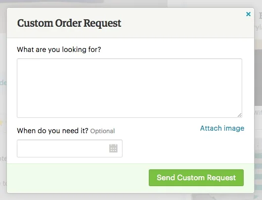
From our initial research we discovered that there is already a “Custom Order Request” feature, which only appears on some sellers' profile pages. We carried out user testing and asked people to ‘place a custom request’, watching how people arrived at this function, and when they did find it, saw how they reacted to it.
Users did not understand it at all; found it too simplistic and counter-intuitive. Most users said they would stop their search here or leave the site entirely at this point.
We found that Ebay, and Not On the High Street were clear competitors, and that Folksy was Etsy’s biggest growing rival. The initial research did not reveal to us how these compared on scale to Etsy. We also looked at indirect competition, such as People Per Hour for bidding sites, and Pinterest, who many Etsy users use for creating pin-boards, yet is not integrated within Etsy’s own website, who have a different system themselves, called Etsy Treasury boards.

Through user interviews with buyer and sellers, we found out that Etsy is not what it once was. People were first attracted to the site due to it being organic in nature, going against the grain of mass produced items and being all about having something handmade, getting to know the personality behind who made it, and quite often it being made by someone in their own home, in the same country, not half way around the world.

Buyers also told us that they feel that this has been lost and that they now feel truly overwhelmed by the amount of products on the site and that, for example, a simple search for a teddy bear would list results far exceeding 35,000 in number.
The site's incredible growth has changed the feel of the site for many users, especially the early adopters, who saw the site’s original philosophy as being to buy, make and sell, unique goods, has been watered down and somewhat lost.
This ‘David turning into Goliath’ insight (term coined by Wired, read the article here) became our strategic focus.
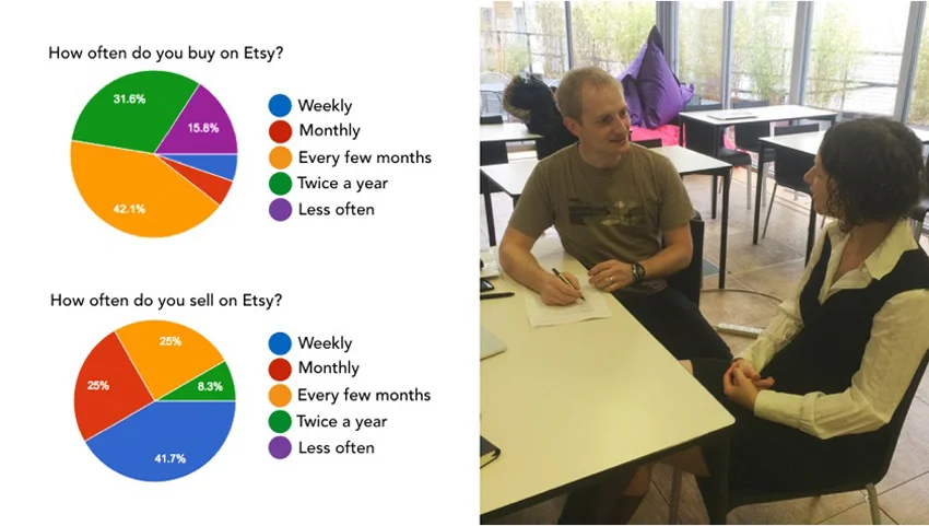
Survey
To better understand this change, our initial interviews informed us of where we needed to ask deeper questions, and we sent out a survey, targeting Etsy’s Facebook groups, Twitter, (using hash tags for Etsy, craft and homemade), and many craft groups themselves.
To see the survey, please click here
One of the Etsy buyers we spoke to, called Penny said:
“I want to know that there's a woman in Kent or somewhere, not a factory, making my product.”
One of our Etsy Sellers, called Sarah, gave an in-depth insight that really got to the core of our task, when she said:
“Etsy has very much changed since I first used it. It was once all about buying unique items but now it is filled with Chinese resellers selling mass-produced items. I use it as an eBay alternate now, but 5/6 years ago it was a true hand-made craft marketplace. They had options for asking for items to be made and it had a very different feel to the whole site. I chose to stop selling on Etsy and started exclusively buying supplies instead.”
From our interviews we consistently found that Etsy's customers wanted them to return to their roots and core beliefs to regain their trust. Customers told us that they were getting lost in the sheer volume of items for sale, with over 30 million listings at any one time on the website, despite having a 4 month time limit on an item being listed. Discoverability for both buyers and sellers is therefore a key issue.
Despite this we found that over 73% of buyers do look to Etsy for custom made products, with 79% of buyers and 91% of sellers interested in a ‘custom-made product’ feature, showing a clear growth market.
Competitive Analysis
We studied the main competitors of Etsy, looking at key features that our interviews and surveys had informed us of. Folksy stood out far ahead of the competition, connecting with their buyers and sellers and focussing on artisans of hand-made crafts that you can build a relationship with.
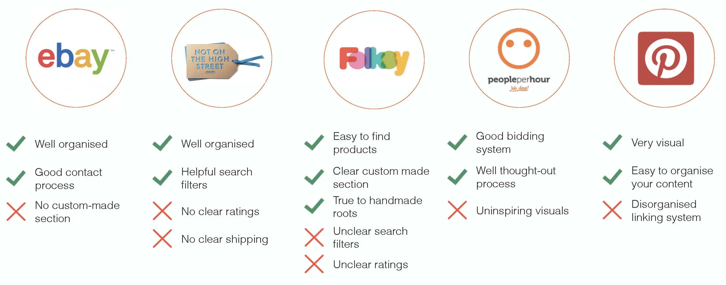

Users found Folksy more intuitive than Etsy, with more sensible results coming in from searches. With Folksy's clear design, Etsy must utilise its best asset, it's historically organic nature, which connects buyers and sellers and encourages the bespoke item orders.
Further to completion of the two weeks on the project, I met and talked to a company called Love Crafts (www.Lovecrafts.com). This young, dynamic company has the drive that Etsy did in its heyday, not to mention significant funding from investors, who see its potential as it champions the connection between makers, buyers and the materials that they might need to create a piece of work that is showcased by the makers.
User Journeys

From an in-depth interview with an active Etsy Seller, called Laine, I created a user flow of her seller's journey. After the initial (and somewhat complex) setting up a seller account, the process of setting up items, saving them as drafts, and publishing them for sale, when she is ready, is fast, but the process is somewhat more frustrated when communication between her and buyers becomes more complex.

For the buyer, the User Flow is somewhat more complex with multiple pain points, from issues along the way. The biggest pain point for buyers is by far the number of items listed on Etsy, and just how many things you must input before narrowing it down, and even then, only so far.
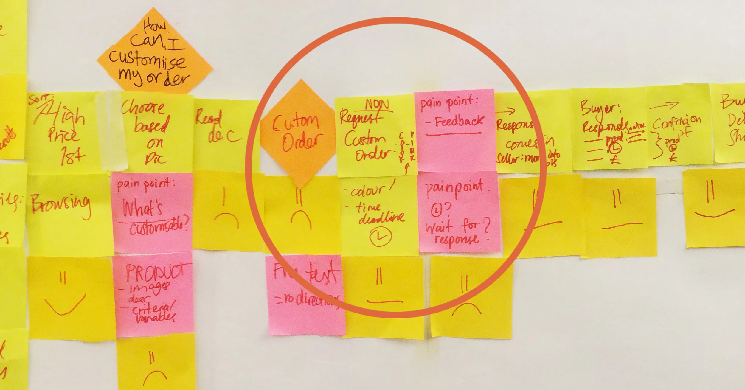
For previous buyers, the bulk of the issues appear when trying to create a custom order, for which the feature for this is wholly inadequate.
The workaround is creating a 'new item' that does not exist, with multiple rounds of conversation, to put in place order specifications, between buyer and seller. Many customers are lost at this point of the process.
Storyboard

To help us focus on the problem, we created a user story of someone looking for a present online, shopping on the high street, and then after failing to find something unique and personalised for her sister, going online to search for the present. By doing this we were able to better understand the problem at hand, and to work out the solution to it.
Our Proposal
We believe that Etsy Customised will connect buyers looking for that ‘one-of-a-kind’ item, directly with talented makers who can create it for them; a return to Etsy’s handmade, unique, community roots.
Personas
From the research we realised that there were three main personas, which would represent a group of users who follow shared common interests, traits, or demographics. By grouping together these people, an overview of all the users can be seen, and addressing the needs of each group can be more easily targeted.

The first persona is Laine, the first draft of which is above, who we realised early on, is a key Etsy seller, but far less likely to use our new feature. She is a hobbyist seller to supplement her income, and only wants to do it for fun, but is open to the possibility of the feature, should it take off; so a late convertor.
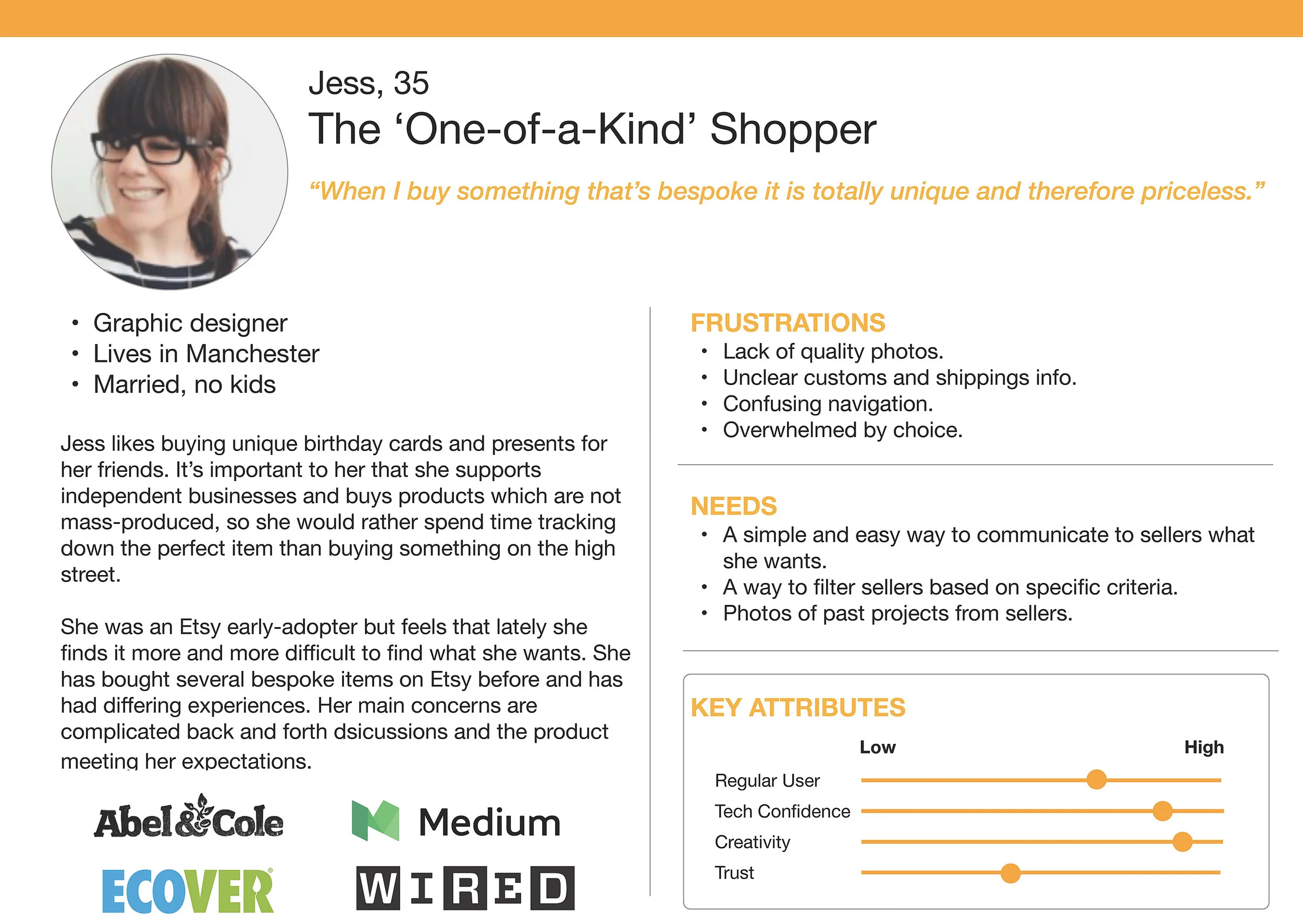

The other two fully developed personas are our key targets for the new site feature. These personas are likely to be regular users of the new site feature and not just hobbyists selling their work, as a side-line.
Design Phase
Feature Prioritisation
We started the Design Studio by running a feature prioritisation exercise to work out what should be included in the designs, based on the interview and survey feedback, with an emphasis on bringing buyers and sellers together.
- A clear process to connect buyers and sellers, provide detailed buyer specifications, and reduce back-and-forth conversations.
- Encourage the use of imagery as reference and that sellers can ‘pitch’ their idea as a positive conversation, not just a “bog standard” quote.
- Facilitate buyer and seller communication as a high priority, throughout the process.
- Prevent spam, by only allowing sellers with high ratings initially, while the new feature is launched.
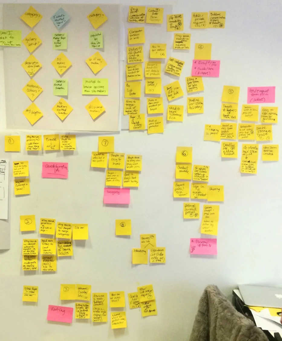
Design Studio
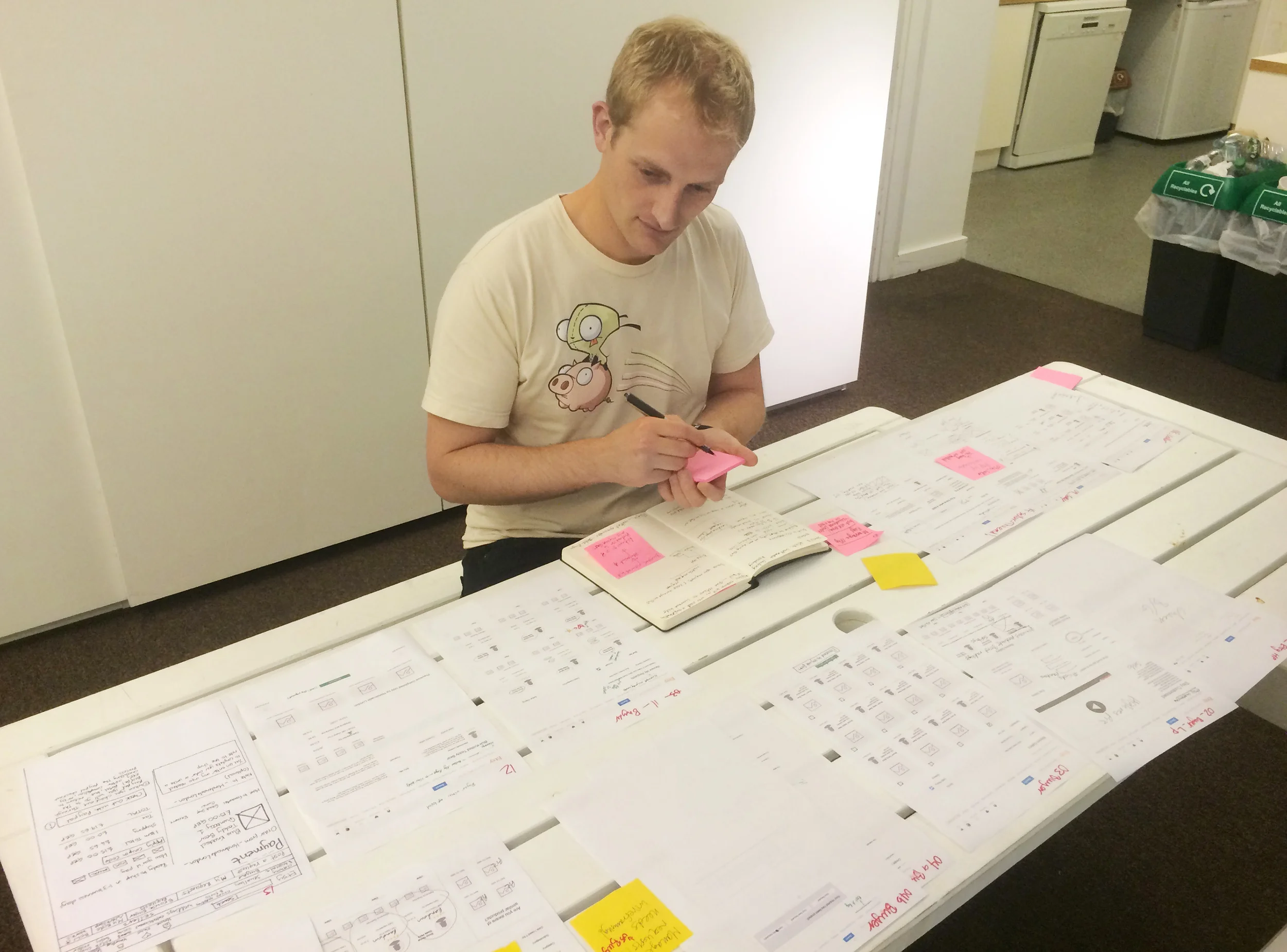
Focusing on our personas, we ran a Design studio, which is a collaborative workshop to generate ideas, designs and sketches, with members from every step of the production process, and to involve anyone with 'ownership' of any key elements of the production process. Our focus was to design the 'customised request' feature and all relevant screens for both buyer and seller.
We held two rapid sketching rounds, taking the best ideas from each person and incorporating them in our designs for the second round. No one design had all the key features so they were combined into a 'master design' for each page, which could be tested with users.
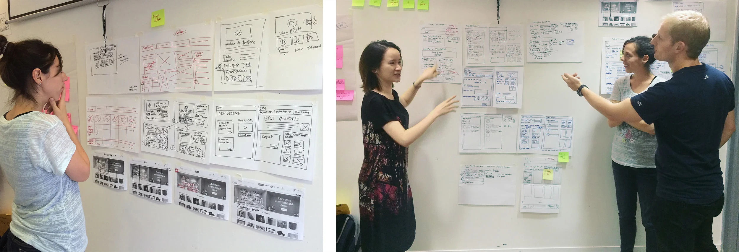
User testing and iterations

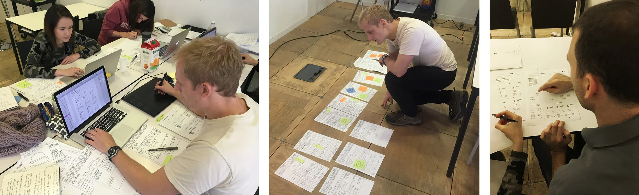
After the Design Studio we ran user testing with two rounds of paper prototype, with the second being further developed, and higher fidelity than the first. Patterns in user feedback were used to develop the initial designs and discover connecting screens that were missing from the process.
At this stage the team split so that half were building the presentation and wrapping up the research, whilst the others continued with user testing and design development and initial wireframes.
I was fortunate enough to take a lead role in working on the low and high fidelity wireframes, user testing and iterations with another team member. This stage of the project was particularly challenging with significant work needed to produce, test, iterate, and develop the numerous key screens needed for both buyer and seller journeys, whilst processing a custom order.

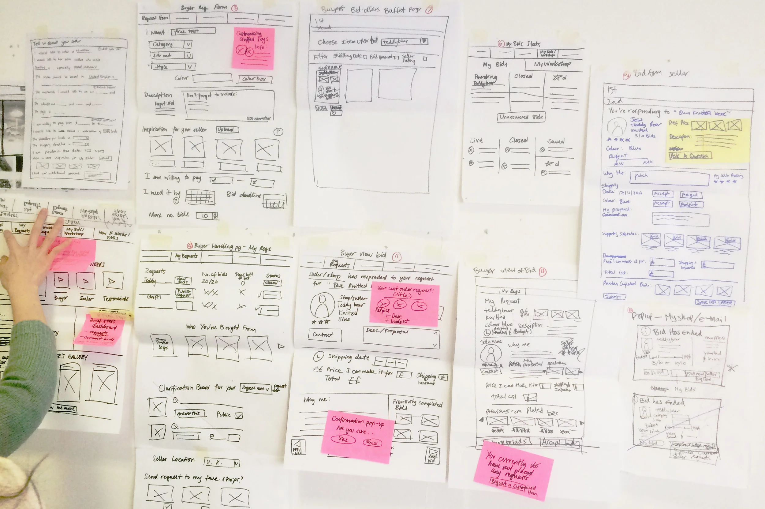
Throughout the testing and iteration process, the key screens that required the most attention and number of iterations were the features landing page (the custom made page), the custom order request form, and the bidders form page for the sellers. Where we had two clear opposing designs we ran 'A/B testing', showing users both designs for feedback on content, layout and design of each page. Many of the user-led changes were due to simplification of screens, better placed screen elements (such as buttons), or clarity of wording.
Digital Wireframes

The navigation bar at the top was the most complicated element to change, with multiple blind tests and A/B tests undertaken to work out what the users would find the most intuitive. The end result is a clear split between buyer and seller information, with the ‘how it works’ videos and customer testimonials relegated to the ‘how it works’ page.

The custom made home page saw the most significant need for testing and modification, which is a landing page for both buyer and seller. The rightmost central panel changed content, depending on whether you are logged in as a buyer or as a seller.
User's unanimously fed back throughout user testing that a ‘shipping date’ was irrelevant to them and that the ‘date I need it by’, was far more important.
Auto-fill elements for category and sub-category, based on item entered was heavily sought after, which should self-populate similar products and the makers' gallery fields below. These features were added after users directly asked to see work that had already been completed using the feature and was heavily tested.

For the buyer request form the 'bid deadline' and the lower end budget value were both removed as users found them unnecessary. The primary call to action was changed to green, as with the first page to encourage users to use the route that would give them the best journey, even though more than one route was requested by people in both the survey and testing.

The description needed some guidance text and the input fields harsh tone was replaced with text that was more conversational in nature; after studying forms on the UI Patters website, which was well received in further testing.
For the seller's bidding form, most elements from the original design were well received by users and implemented.
The use of labels and encouragement of annotated notes is the key improvement, as well as field next to the accept bid as guidance text.

Presenting to the Client

For our presentation to industry experts and peers, we realised that the journey and relationship between buyer and seller was Etsy’s strongest building block, and that by using this conversation, we could champion the findings, which were that Etsy would be best suited to getting back to their company roots and how Etsy was in its conception.

As a means of engaging with the audience better whilst presenting, I came up with the idea that we should introduce our personas, which we created from our interviews and survey results, through role-playing them, via a video screen. This was, in essence an introduction to the ‘How it works’ feature, showing how testimonials would play, but in this instance, really championing the new feature and explaining to the members of the ‘concept’ Etsy board, why we believed that Etsy needs to return to its roots with this custom made feature.
Future Development
A further feature, yet unexplored, is to create a chat feature between maker and buyer, very much along the lines of chat conversations, such as Apple, that follow a stream of conversational text, instead of endless e-mails back and forth, which are fragmented.
The 'How it works' page from the main Etsy Customisable menu should be developed. This could be populated with video testimonials, which could be championed across the Etsy site, bringing confidence to buyers through positive feedback from previously completed sales/creations.
Fully integrate Pinterest, as a pin-board, instead of their current requirement to use Etsy's own 'Treasury Boards’. This function is entirely redundant as our user research told us that none of the Etsy’s users that we surveyed use it, and that they all use Pinterest anyway.
With all pages designed with mobile-platform functionality in-mind, the mobile format of Etsy Customised should be designed.
The Prototype

In closing...
The journey and conversation between buyer and seller is Etsy's strongest legacy, and by concentrating on it, we feel that their customer base can not only be shored up, but would gain significantly, not to mention keep customers satisfied, and not lose them to up-and-coming rivals Folksy and Love Craft.
I very much enjoyed working as team facilitator and was fortunate enough to work within a great team, who worked tirelessly to create a great solution to the brief, despite complex user screen flows for both buyer and seller that integrate into a simplistic, easy-to-follow solution for the customers.