
Waitrose Food Planning Micro-Site
Personal project, peer reviewed: On this project I worked solo, but solving a concept project for Waitrose, with peer review performed by industry experts and fellow UX Designers.
Duration: Two weeks
Tools and Methods Used: User Research, Agile Workflow, Paper Prototyping, Pop App, OmniGraffle and Sketch (initial wireframes and high fidelity wires), User Testing.

The Brief
To create a food planning micro-site for Waitrose, where customers can view recipes, select them and populate baskets with their ingredients.
The Client
My concept client was Waitrose, a chain of British supermarkets, which forms the food retail division of Britain's largest employee-owned retailer, the John Lewis Partnership.

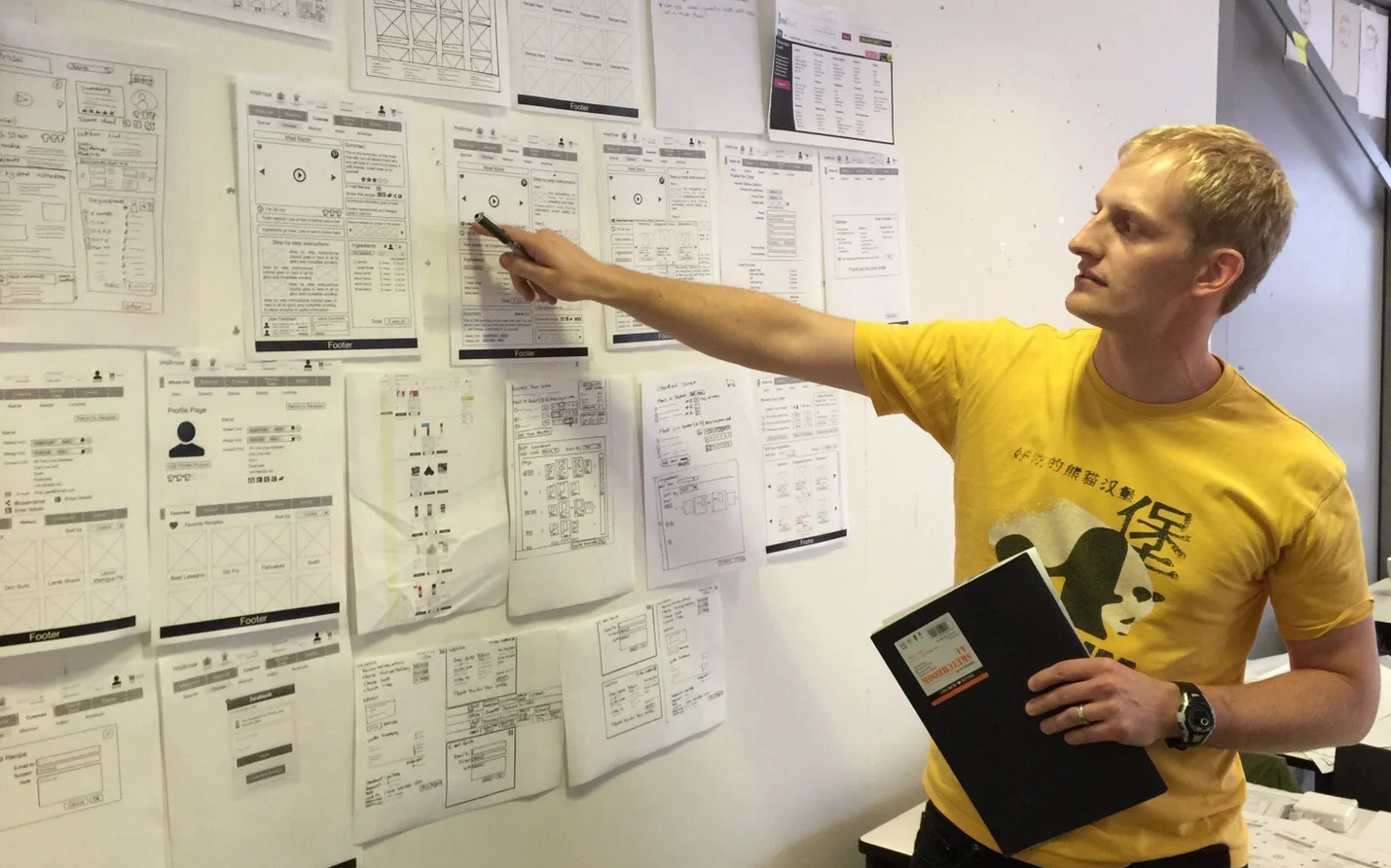
Project Highlight - Creating a detailed low fidelity, interactive modular ‘paper prototype’ with pen and card, for extensive user testing, for rapid iterations, and design development.
CASE STUDY
Discovery Phase
After digesting the client brief and analysing all that was given to us, I was able to target the essence of the task at hand. My task is to create a visually led journey through the Waitrose micro-site, with clear steps to order recipes and remove unnecessary ingredients.
Social media is a strong part of the users' lives, and use of technology can be harnessed to continue the user journey into the kitchen for a fully immersive experience.

Competitive Analysis

Research was carried out by directly visiting high street stores such as Whole Foods, Sainsbury’s, and Waitrose itself; going to the direct online competitors', and looking at local indirect competitors such as your local Indian/Italian/Thai restaurant or take away pizzeria. The main attributes of the new site feature were compared across all the main competitors websites.


I discovered that the BBC 'good food' website was the best at addressing the concerns of the target audience, yet users told me that its landing page was overwhelming, with nothing visually engaging; just lists of categories and items.
Of the competitors’ websites, the most important thing to note is the visual nature of some elements that were really engaging, from the layout of the ingredients and method of one of them, the use of scattered and alternatively placed images in another, and the gallery view of a third site, all elements that can be incorporated.

Personas and secondary interviews
From the initial personas provided by Waitrose, a list of user needs could be created. In order to better understand the users, I converted the users' pain points and wishes into positives of how they would ideally be solved, so that I could better understand what their priorities were.
Once the initial personas were digested, a round of secondary interviews was held, to really delve deeper into the key wishes of all three core personas, especially Jackie, who seems the most likely to use the new micro-site.


For this reason the next round of interviewees were people with similar lifestyles to Jackie, but who also overlapped the other personas. This did indeed reiterate the findings, as well as find more insights, to impact upon the site design.
From the interviews and observations, there were two key take-away streams, features that were must-have’s and features that were requested, but not essential for the micro-site to be launched.
Must haves:
- Good pictures
- Integration of social media
- After Work/Flexible Delivery
- Prices of items
- Money saving tips/features
- Downloadable instructions
- Option to save recipes
- Clear preparation instructions
- Fresh ingredients
- Easy navigation
Medium haves:
- Quick checkout
- Ethnic variety/cuisines
- Option to add/remove items
- Adjustability of product quantity, e.g. meal for 2/4/6 people


User Journey
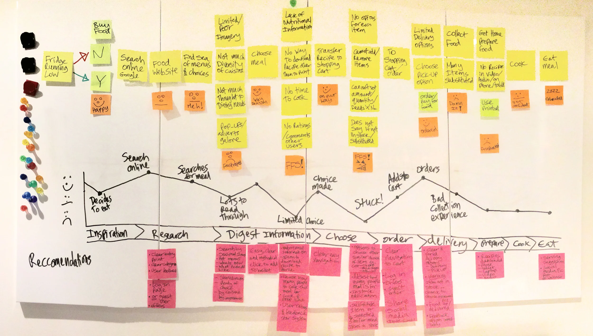
The user journey for buying items on a website, and how the user would normally follow this through, was key to working out where the pain points really caused people problems, and made them decide to just visit shops, rather than retain them as regular online shoppers. The pain points specifically fell into three main areas; too much to look through, limited choice and a bad collection experience. These pain points had clear ways that they could be improved upon also.


The means by which items could be searched for could be far simpler. The recipes can be shown as menu/image libraries, with clear categories, nutritional information, options to download recipes, and ways to view it easily after purchase.
The need to adjust quantities of food, to remove or change the number of people cooked for, would go a long way to resolving food wastage. Also having in-built social media functionality would mean the modern lifestyle and user retention can be accommodated.
Card Sort

The brief itself came with an inventory example of 106 items, which were initially card sorted as a means of understanding the products that would appear within the micro-site. A sample of 7 subjects was taken, asking them to group and then name the groups that the ingredients would fit within, as a means of understanding categorisation and to generate well-understood navigation menus.

The task results showed that there were clearly understood ‘major’ and ‘minor’ categorisations, from simple or complex groupings, but that the actual need for this was only needed for the back-end of the micro-site, and not the upfront categories, from which interviews told us another system would be needed.
Site Map

From the card sorting and interviews two organisational systems were created, one for the recipes and how you see the tabs and search system on the micro site, the second is the one in the background for logical storage of the items in the warehouse.

Design Phase
Design Studio
For the purpose of really understanding the different aspects of the site, and the look and feel of it, we held a Design Studio, whereby a group of people with vested interest in the micro-site’s development came together to brainstorm for ideas, in a controlled environment, with design-sprints to generate the maximum amount of ideas and layouts as possible.
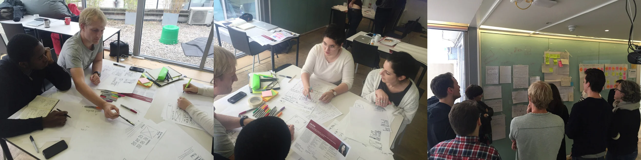
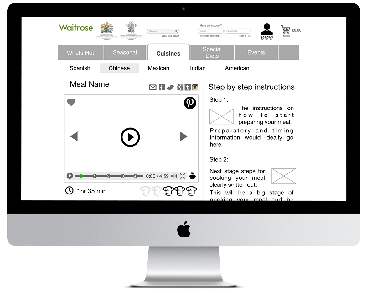
The Design Studio session really highlighted where the users would enter the site and all the information that they would expect to see on the page, how to navigate it, and some interesting ideas about how to represent the skill level, with chefs' hats, and use of video as an introduction and instant visual landing image, as you reach any of the recipes.
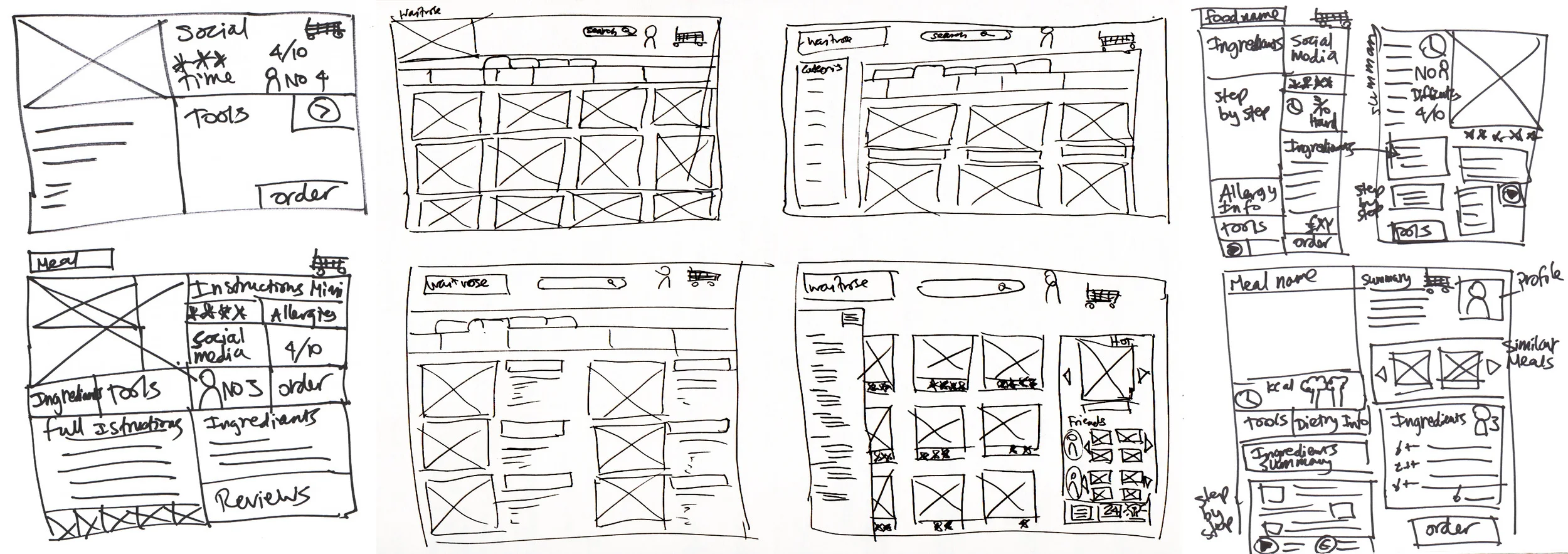
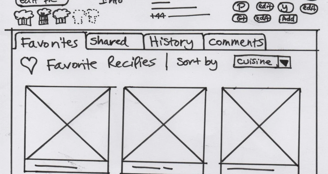
From these initial designs, I was able to develop it into a first high fidelity paper prototype, with all initially mapped out site pages created. The main landing page in gallery format was generated through research feedback, following through to the main recipe layout, which needed extensive user testing.

Throughout the user testing, I asked users to perform basic tasks, which would require them to navigate through multiple screens, without 'leading them' to where things were on the pages. An example of which is "You have reached the Waitrose micro-site. Could you find a Chinese recipe for me please?", yet with no Chinese option within the Navigation bar.
From these simple questions I was able to find out that some of the information was not clear as to where it was, like the video tutorial, social media, and e-mailing the recipe to yourself. Other instances were duplication of profile image on the page, general clutter and wish for information to be more spread out.
Digital Wireframes
After three rounds of testing and making changes between each round based on testing feedback, I was able to confidently move onto the digital wireframes in OmniGraffle, confident that the results from user testing were from patterns forming, rather than just opinions or coincidence.


From user feedback the layout of elements in the page was re-ordered to emphasise the order in which users expected to see items, but also so that key elements would appear on the page at the same time, for those visiting the site, whilst cooking.
For further accessibility a 'cooking' mode was added with the cooking pot icon, whereby the screen would rescale, with just the video and step-by-step instructions still in view. In tablet/cooking view, elements such as the step-by-step instructions would become scrollable, with each instruction point having a marker on the video timeline for speedy access.
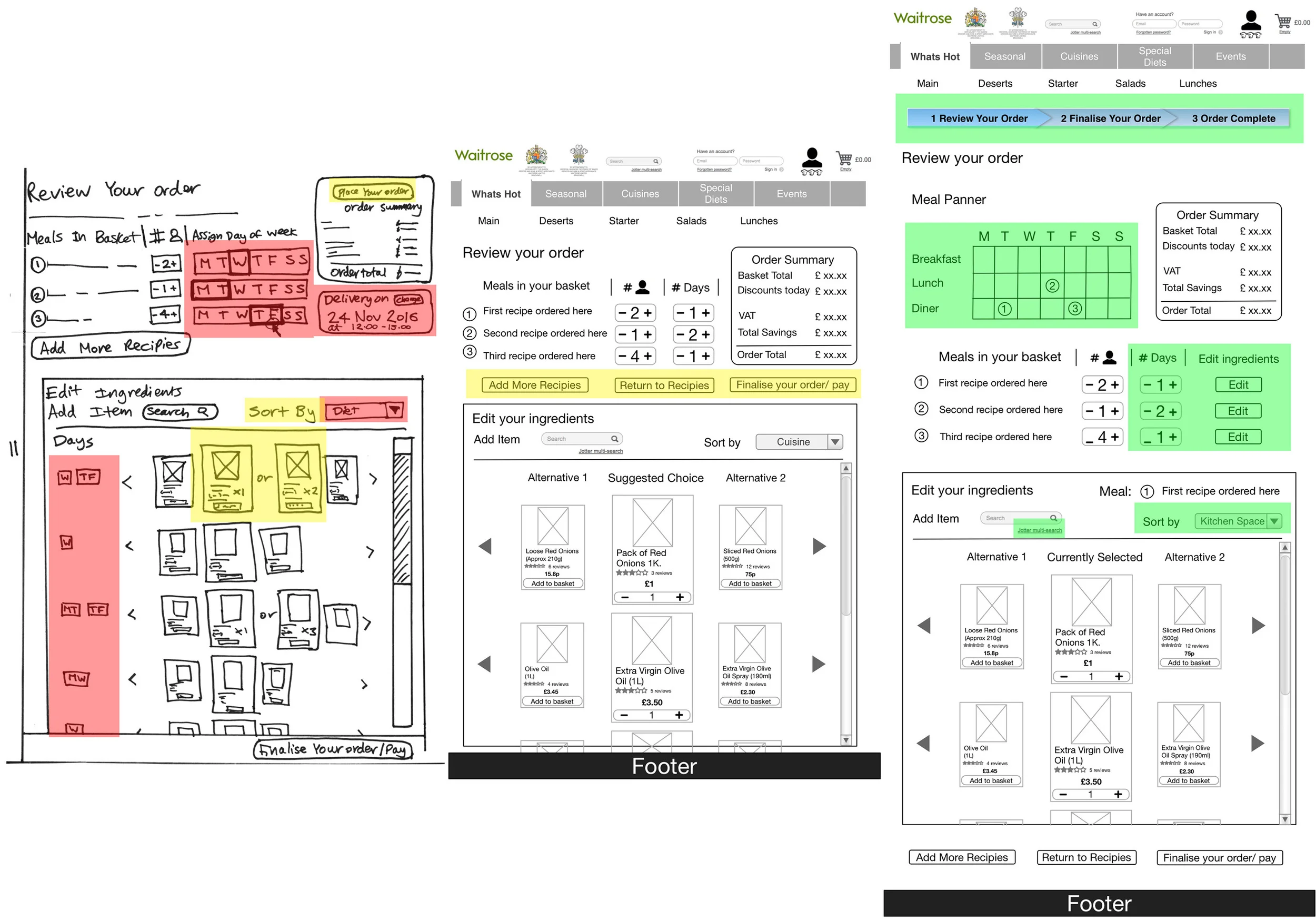
The meal planner by day was re-introduced after further interviews and testing onto the recipe page by simple box checking format, with the search ingredients list not visible on the ‘review your order page’, until you click on edit ingredients, to prevent clutter, after feedback. The options for adding days of the week, as well as number of people to cook for, was also added.


Future Developments
Whilst going through the development process, it was clear that a fully designed and tested wireframe was needed for the ‘cooking’ view option, available from the video (Pan in the bottom right corner), for tablet format. This format has been designed for a full screen video and also for split screen video/step-by-step instructions. In both formats the steps would appear as the video progresses as instruction bubbles from the timeline, and in the split screen mode, the instructions would scroll whilst the video plays, meaning it can be hands free.

The final development would be integration of the populated shopping cart, back into the main site, as an option for users who wished to do more shopping on the full site.
The Prototype
In closing...
Understanding the structure of the company and running deep studies of the competitors’ key features and USP’s helped to direct the contents of the new meal-planning feature. User testing was used for feature optimisation and site usability, whilst integrating social media and responsive design for ease of use whilst cooking.
Overall I really enjoyed creating a new feature that would both work in its own right, and also be able to tie into the website in new ways that really integrate Waitrose as a brand, into the busy lifestyles, that are ever more reliant on technology. The ability to convert Waitrose from a shop into an interactive cookbook was really exciting as a means for Waitrose to engage with its users at every step along their journey.


