Mums Meet
Solving a real-world problem
Personal project, peer reviewed: On this project I worked solo, but solving a real-world problem of fellow UXDI student Katie Valentine, with peer review performed by industry experts and fellow UX Designers.
Duration: Two week split project. Week one: discovery, definition and design. Week two: visual design.
Tools and Methods Used: User Research, Agile Workflow, Paper Prototyping, Style Tile, Mood Board & Colour Pallets, User Testing.

The Brief
Research, design and test a user-friendly mobile app that addresses and solves a real-world problem of a user's everyday life, by creating an interactive prototype.
The Client
My client Katie and her friends are looking for a website or app that can help them to find baby-friendly venues and to share that information and organise social gatherings.
The Solution
'Mums Meet', a mobile app that lets parents search for local cafes, children/baby orientated shops and local amenities, and to invite each other to an event at a suitable venue.

Project highlight - Delving deep into problem analysis, finding a user’s true pain points and discovering the best way to address them that would answer their needs.
CASE STUDY
Discovery Phase

After an introductory conversation with Katie, my client, I spent some time analysing what her thoughts and frustrations were, and working out ways to help her to solve these problems.
Katie and her friends are looking for a website or app that can help them to find baby-friendly venues and to share that information and organise social gatherings. At the moment Katie and her friends are frustrated at how the information is hard to find, and that it is quite hard to organise a meet-up together, convenient for all of her group.
At the start of the initial conversation I was able to create a concept map to work out where the crucial elements of Katy and her friends' main problems stemmed from. I was clearly able to see that there was not just one element to the problem, but in-fact two parallel issues, revolving around finding a venue in the first place, or finding somewhere suitable whilst out and about. This, in-turn led me to believe that an app was more appropriate for my client, whilst ‘out on the go’, than a website.

From this key decision I was able to clearly conclude that my aim is to: 'Create a simple, user-friendly app, which can search for local cafes, children/baby orientated shops and local amenities, and to invite each other to an event at a suitable venue'.
Interviews and User research

After the initial conversation I was able to ask Katie some further questions, delving deeper into her problems, much of which was very strong feedback that highlighted the crux of the problem.
“When I am looking for venues to meet up in, probably one of the most important things I look for, are baby change facilities, because a lot of cafes and pubs do not have these, and it can result in a not-so-great experience for me and my baby”.
“When I am out and about, I would like to easily and quickly find baby friendly cafes”.
“When I am carrying my daughter in the baby carrier, it can be very hard to find somewhere in the nearby area”.


From market research I found that there were a few apps, aimed at mothers who were looking for other mothers in their area to meet up with. These apps were very much built in the same way that dating apps sometimes are, looking for people in your local area, showing a profile, with interests, and a rough area map to say where they are in relation to you. I saw that many of them also had a chat feature, including those for arranging play-dates for children with one another.
It was clear from this research that the app would need to focus on the aspect of finding the locations as a primary design, and from that, be able to create a meeting at one of these locations and to send an invite to a group of friends that you already know and have contact with.

After questioning the need for so many venue features within the app, I gained clear insights into their need, and from this we concluded that they could be represented with icons for each, such as baby-change, disabled access, kids menu etc.
The initial app design, showing the key windows was well received, with distinction of the various venues through colour (Cafes, soft plays, local shops) and an added indicator on the map view to denote a 5 minute walk from your current location (the speed of which you would set-up as you create your user preferences).

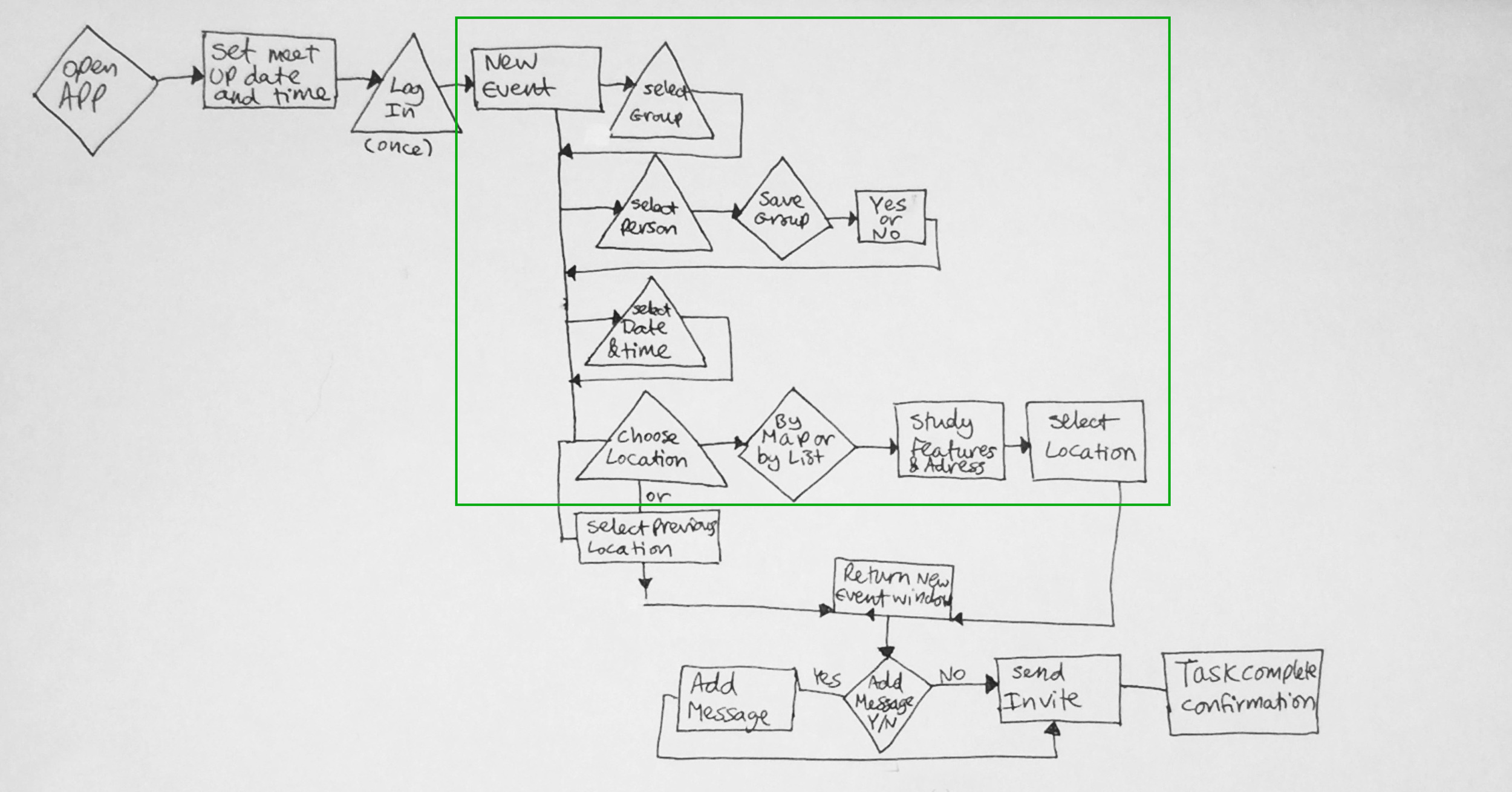
From the further conversations I was able to create two user-flows. The first addresses the task of creating a new event, part of which, you would search for the location, before sending the invite to your friends (marked in green).
The second, (below) searches by location within 'map view', or in 'detailed view'. This function would finish upon finding the location that you are looking for in the local area.
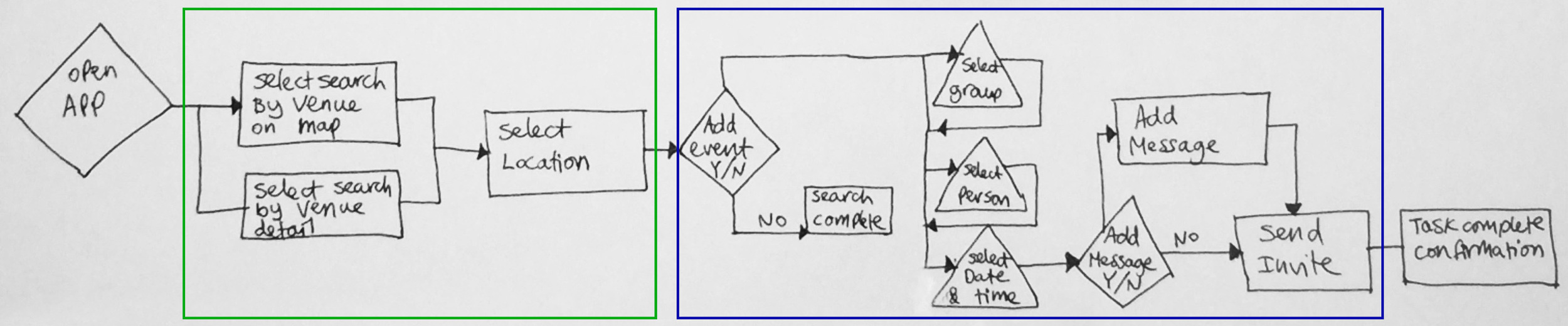
At this point you would have the option to create an event, using the location already inputted, as you open the new event window, with the app recognising this search journey independently of the first option.
User Testing, Iterations and Prototype

After creating a second and third iteration of the app screens, I was able to gain further insights and ways to improve the app from both my client and other parents, through user testing.
From the collective feedback I was able to learn that some design ideas or the way they were represented (through alternative function/action design) won over the alternative designs and that the in other cases, clarity of information through targeted features, or information positioning, was very well received.


The features window was significantly redesigned, in order to champion the user feedback for the various icons, with priority implementation included for users to be able to see if the venue did indeed have the features that are listed. An order was also implemented so that features that they do not have, are in grey-scale, instead of colour, so that they drop to the bottom, but can be added by users, should the information change.


The final window went through three iterations with my client to get the feel that she wanted, in order to receive the final invite information in the clearest way possible and to deliver that to her group of friends.

After design feedback, further research was carried out to work out the priority order of the icons in the features tab for the venues, as well as the importance of the filter options in the two map search pages.


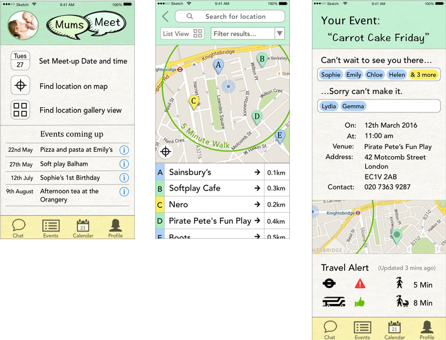
The final app, named ‘Mums Meet’ has two main functions, letting you search by either map, or detail, or letting you go straight to setting up an event at a suitable venue.
Within the search function, the ability to add a group of friends you have previously set is an option, as well as venues that you have previously visited. Before sending the event invite out, a message can also be added.
Within the confirmation message, all of the details for the event venue; time, date, location, inclusion of a map of the very near vicinity, and its address are all included. Directed by client feedback, driving and walking directions and a quick link to any travel alerts are also at hand, for later on, when people are re-checking the event information, before they leave the house.
Visual Design and High Fidelity
Brand personality & Questionnaire
For the purpose of trying to understand the brand personality, I asked a number of people to look at the screens, with the simple description of what the apps function is, and asked people to tell me what the brand meant to them, looking at a stack of 30 adjective cards and choosing the 5 cards that best described the app in its current state.
From here I asked the same people to then describe their thoughts as to why they chose these 5 cards. The first table shows an average response for the adjectives, and the second table below has the recorded thoughts from the responses, in more detail.


This information is really informative as it expands upon the basic information, and really delves into the mind-set of mums’ lifestyles, preferences and what key features they would be looking for in this app. The final information that I was given was for the ‘brand personality’, which tells me about how people see the app that I am creating before it hits the market, which I am happy to see does fall in all the places that I see as key priorities.
Wireframing and high-fidelity mock-up
Further to the initial testing, with the paper prototype, via Pop, the app was well received and required translation to a full wireframed model, population of assets and further testing. The next stage of testing incorporated sketched map elements and remained as grey-scale with simple icons, so as to get clear feedback.

User testing revealed that the ‘Mums Meet’ logo was not conveying the right message of a meet-up between mum's that already knew each other, and instead was confused with a parent finder. This was essential to amend, as this is not the purpose of the app.
In the centre screen, users did not understand which map point related to which location, and although this should be clarified with colour, users requested another means to label them.
This is a great insight for people who are colour blind, even when the colours are added. Furthermore, people asked how they were meant to ‘zero’ their location on the map.
In the third screen the friends' names were listed with profile pictures, but usability testing revealed they were too small to either read, or click on with large fingers! The three buttons were also completely confusing to users, as both whether they were buttons or not, o what their function was.
Mood board, Colour Pallet and Style Tiles
Once the initial designs were tested in Pop as a clickable paper prototype, there were a number of methods that I used to relay my ideas to Katy, my client, and get as much input as possible, as to the style, feel and direction of the app's design.
One of these methods was to share some quick-fire previous sketches that have some colour palettes/combinations, which might have some input towards the final design.

A combined mood board and colour palette, was used to relay references for colour, icon design, relative content from other media sources, the feeling of some texts and what it was relating to, and the people that the app would be targeting.
With all this information in mind, I created a ‘Style Tile’, which I presented to my client. This accompanied the mood board and colour palette and was refined after speaking with my client, and once again, after the first round of wireframes was created (below), with all the colours implemented.
The exception to the style tile was the colours that appear within Google maps, where the source data from the maps feeds from.


The first round of high-fidelity wireframes was very well received. However, the users mentioned that, although they liked the look of the first screen, everything felt far too large, especially the icons in the footer navigation bar. The rest of the screen, once resized would have plenty of extra space, which would mean it could be populated with information such as upcoming and immediate events.
Users also commented that the use of a 'start and end' locations function was unnecessary, as they would prefer to use other apps which already performed this function very well, like City Mapper, which they would use instead.

The question above is one that was asked, in the first round, but again after the first coloured wireframes were created, asking qualitative questions with defined answers. The answer to the question above gives a very interesting insight to a problem that needed to be addresses as it would have a huge impact upon the success of the app, or not; but was not picked up on in an earlier round of testing.
This person mentioned that the font used within the app looked like an old Apple font that is now redundant. The font used was Cambria Math, but I was told that it looked like Lucida Grande; which was noticeable enough to the eye that someone related it to being out-dated! By changing the font to the newer Apple Font, ‘Avenir’, the app is once again, looking modern. I did consider using the new Apple font ‘San Francisco’, but it looks somewhat identical to the old font ‘Helvetica Neue’, which is a dated font!

The final iteration of screens (below), are screens updated from the various comments that were made, especially those made by a number of people; therefore forming a pattern, in user feedback. The first screen now has space for upcoming/current events, and much more sensibly sized search functions.
The second screen has more space allocated to the top navigation, but the space of the table is reduced in total, giving the map more screen real estate. The third screen sees significant improvement to the friends' fields, with a lighter blue colour, larger text and a much clearer font, ‘Avenir Medium’. Spacing between all text fields is also much more uniform.
These are the three key screens and the remaining screens from the initial prototype will be created shortly, with a new digital mock-up being available immediately afterwards.
Future Development
Creation of the user profile. Setting up distance walked within 5 minutes for both pram and baby carrier options. A personalised priority list for the features of any venue (e.g. highlight disabled access as being most important).
A personalised priority list, within the user profile, for the features of any venue (e.g. highlight disabled access as being most important).
Further research with a wider audience to find out what the most suitable and recognisable icons would be for the many features that any venue may have.
Populating the calendar and events tabs, and how they interact with one another, and developing all remaining screen into high fidelity mock-ups.
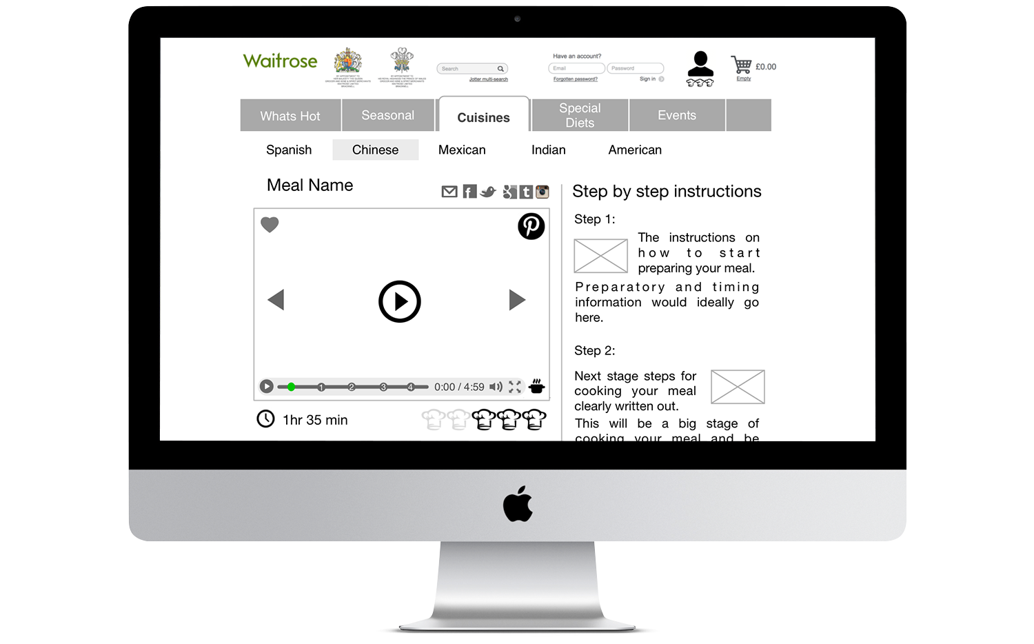
The High Fidelity Mock-up

In Closing...
Within a split two-week period, I produced a fully functioning clickable prototype that addressed the needs of a user. The solution was worked up to a high fidelity standard that was user tested, with a view to completing the remaining screens at a point in the near future.
I particularly enjoyed taking the initial designs into Sketch and turning them into high-fidelity mock-ups, developing them directly with a user and really responding to their needs, through user testing and feedback. The app itself was very well received and I can also see it being well received and used in the real-world, should I have the chance to develop it further some day.