Navig8
solving usability issues for the visually impaired
Group project, peer reviewed: On this project I worked within a team of five. Other group members were: Ramsay Albazzaz, Dean Lalap, Marika Devan, Naque Mohd Faizil.
Duration: One day 'Design Jam' Hackathon.
Tools and Methods Used: User Research, Agile Workflow, Design Studio, Paper Prototyping, Digital Prototype andUser Testing.

The Brief
Create a solution for users who are visually impaired, which helps them to navigate public transport.
The Solution
An app, which helps visually impaired people, get on and off the bus, with the least amount of stress possible.

Project highlight - Creating a fully functioning and realised prototype in just one day for a project that could make such a difference to so many, enabling them to have greater access to the wider world and their surroundings.
CASE STUDY
With modern technology we always ask the questions needed, to ask about what makes an app, device or website successful. We first looked at the number of people who may use it, who could use it the most, and a plethora of statistics to show market share, future growth and success metrics, but we can often forget about usability in its rawest sense. Usability doesn’t just help some people; when it is done right it can transform peoples’ lives and the way they interact within the world around them, specifically their journeys to various destinations and by using public transport.
Usability in its rawest form is at its most important, for people who can have their lives transformed by an app; that can help guide them and fill in where senses are reduced or unavailable, help them to be more mobile, and in-turn give them the same affordance to any other person navigating any environment.
The Brief
The task of the 'Design Jam' Hackathon was simply to “Create a solution for users who are visually impaired, which helps them to navigate public transport”.
Discovery Phase
Through rapid research we learnt that over 285 million people in the world are visually impaired; of which 39 million are blind and 246 million have moderate to severe visual impairment (WHO International, World Health Organisation).
In the UK there are some incredible designs coming out that could help this group of people live uninhibited lifestyles, complemented by modern technology. ‘Wayfinder’ is one such company, who, by means of using beacon technology, help visually impaired people navigate from street level down to tube stations.


iBeacons are low-power transmitters, which send small Bluetooth packages at set intervals, acting as pulse generators that can be seen wirelessly. By placing beacons in ‘known spots’ and using an App within a smartphone, you can work out where you are within the space, by comparing the signal strength between the beacons, and directions can be given at intervals throughout the journey. These can be communicated by audio, using ‘bone conducting headphones’.

We were fortunate enough to be briefed via Skype by Alastair Somerville, founder of Acuity Design (and specialist in sensory comprehension and Haptic Design), about many features of Haptic feedback, its uses, and be shown a video of how a blind person crosses a road. We were shown a clear demonstration by Tommy Eddison, in New York, with raw footage of people driving all around him, despite clearly using a white cane.

The strongest message to take note of from this conversation was that we should “Enhance and enable the experience; don’t be the experience”. When designing for those with visual impairments the priority should be to enable them, through complimentary information that does not detract from their own experiences, nor leave them lost, should technology fail.
Haptic Feedback
Further technologies that can assist in giving users direct feedback are those that use ‘Haptic feedback’. ‘Haptics’, is the use of the sense of touch, in a user interface design, to provide information to an end user. This is quite often done in the form of vibrations. Alastair made us aware that there are areas more sensitive to feedback from these devices, as researchers aim to “find a space on the body that information has not been given to before”. These include the upper arm, round the back of the head, and lower back, especially around the tailbone. The least sensitive areas are the wrist, ears, and right in front of the eyes.

A prime example of this are the US Army’s Haptic Belts, designed to guide soldiers on the battlefield, especially in conditions of low, or zero visibility. The belt provides vibratory or tactical cues allowing a soldier to navigate to map coordinates and receive communications, whilst carrying a gun.
Significant breakthroughs have been made for visually impaired people, especially for audio devices aimed specifically at those with reading difficulties, or who need to be able to enhance their senses, while not blocking out important information such as street traffic; whilst navigating their daily commutes. ‘Aftershokz’ are one of many companies that sell ‘Bone Conduction’ Bluetooth technology, wireless headphones that do not enter or cover the ear, but instead sit next to the ear. Small vibrations are sent through the cheekbones, directly to the inner ear, delivering sound, without reducing other vital senses.

Further technology, ‘Bragi’ designed by Nikolaj Hviid, former Design Director of Harman Kardon, and previously making products for Audi, is making waves in the technology sector. The ‘Dash’ computer within them is what secured him over $3 million in funding on Kickstarter to help them become a reality.
This new breed of headphones, albeit over £300, allows you to choose what you want to listen to, can absorb conversation, whilst blocking out street traffic, through directional selection; or even allow some sounds through, like clapping, whilst filtering out music from loud speakers. The technology has significant on-board data storage, allowing for companies to re-appropriate them for other uses, and with the combined ‘Bone Conduction’ technology, and selective traditional headphone technology, it is only a matter of time before a company utilises the potential in them

Design Phase
With the task being to “Create a solution for users who are visually impaired, which helps them to navigate public transport”, we started by running a quick brainstorming session for possible solutions to the design problem at hand.

Two clear alternate paths were created, one of which was for a visually impaired person to book a journey on a train, or tube, and have a member of TFL greet them at the other end, with confirmation to the user, of who they would be meeting at the other end.
The second path joined the user at a bus stop, with them having already planned their journey and helping them overcome all the challenges they face whilst trying to locate the correct bus for them, know when it would arrive, and when the right time would be for them to get off. The two paths were voted on, with merits discussed as a group, before focussing on the bus journey as the place we could help the user the most with.
The Solution: An App, which helps visually impaired people, get on and off the bus, with the least amount of stress possible.
Why: If a visually impaired person misses a bus, gets on the wrong bus, or misses their stop, it can cause significant stress, not to mention waste a lot of time, thus making any small journey a challenge, that warrants significant planning and allocated time available.
How: We realised that by creating a watch app, (that could also run from an android or iOS phone), we could provide warnings to the user that their bus was approaching, as well as notifications throughout their journey to ensure they get off the bus, at the right place. Our design feature would enable users to set their journey destination, so that it could not only be used for common routes they knew, but open up new routes to them, giving them more freedom with travel.


From a quick features analysis exercise, we were able to quickly prioritise the features that were essential, and that we would be able to implement, in the limited time period of the day. Concentrating on the core journey of the user, how best to help them and only giving them the essential notifications to guide them, without leading them and overwhelming them would be our greatest focus and challenge.

In our efforts to better understand the user journey, we visited a bus stop down the road, to see what visual clues we could learn from the environment, of ways that we could help the users who are visually impaired.

The signage for the general population is diverse, from the bus stop sign itself, bus timetables that are complex, with small text, which are often missing (one side was broken and missing entirely), and bus information by text also. This sign in particular notified us that there is bus-tracking information, which can be pinpointed to specific bus stops, which could enable us to provide customers, with this information.


One last clue was that although many bus stops in central London do have the red circle on white; which signifies that all buses must stop, many buses have the alternate white circle on red; which means that buses should only stop, when requested to do so. This in itself is not consistent, and bears a challenge for people with visual impairments as they might miss a bus in the first place, and once on the bus, they cannot simply count the bus stops to get off, as some might be skipped altogether.
For the purpose of understanding all the challenges that a visually impaired user may face throughout their journey, we ran a quick user journey/task analysis. We came to understand that there are a lot of worries that many of the population would not even consider, such as knowing which bus was the right one and the worry that it may cause if you get on the wrong bus. This is a big pain point that can cause a lot of stress to people that could be sent in the wrong direction, to areas that they are unfamiliar with; especially for those who memorise their routes by directions and numbers of footsteps between locations, on any particular route.
Design Studio

We ran a design studio with two UX Designers, one Visual Designer, one Developer, and one Engineer, bringing people together from every stage of the development process into a concentrated design session. We split the session into design for the on-boarding of location search, choosing a bus, with countdown notifications, getting on the bus, status notifications, and alerts to get off the bus.


Our initial designs relied heavily on using buttons within the full screen, with 'home' buttons using up prime screen space, but the most simplistic navigation tool that we could use was not a series of screens connected by buttons, but movement forwards and backwards, using swipe gestures, which are more intuitive.
The above illustration is a rapid development of three screens/windows, whereby the number of features on each screen is rapidly reduced to make them as simplistic as possible. We quickly realised through user testing, that for ‘Destination’ there was no need to have any buttons for planned/usual destination vs. ‘New destination’, and that simply using voice recognition, a location could be inputted, repeated by Apple’s ‘Siri’, and where the destination is not correct, holding one finger on the screen whilst speaking a new location, is needed.
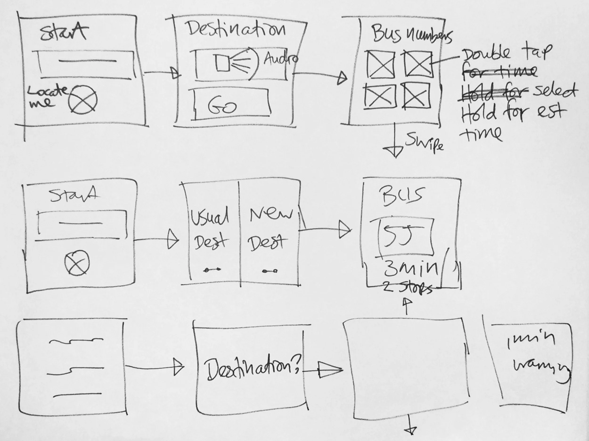
A key insight was that buttons that change position could be confusing for users, so all movements forward are done with a swipe motion to move to the right, and all movements backwards are swipes to the move to the left.
We also realised that, although people would want to be provided with the fastest bus to their destination, or the one that arrived soonest; some passengers that know their route might prefer a longer route. This could be due to fewer turns, which could make them travel sick, and without the ability to follow their journey visually. For this purpose the up and down swipes would move you to the next bus number that may take a different route, once again speaking the route number, time of arrival, and journey time.
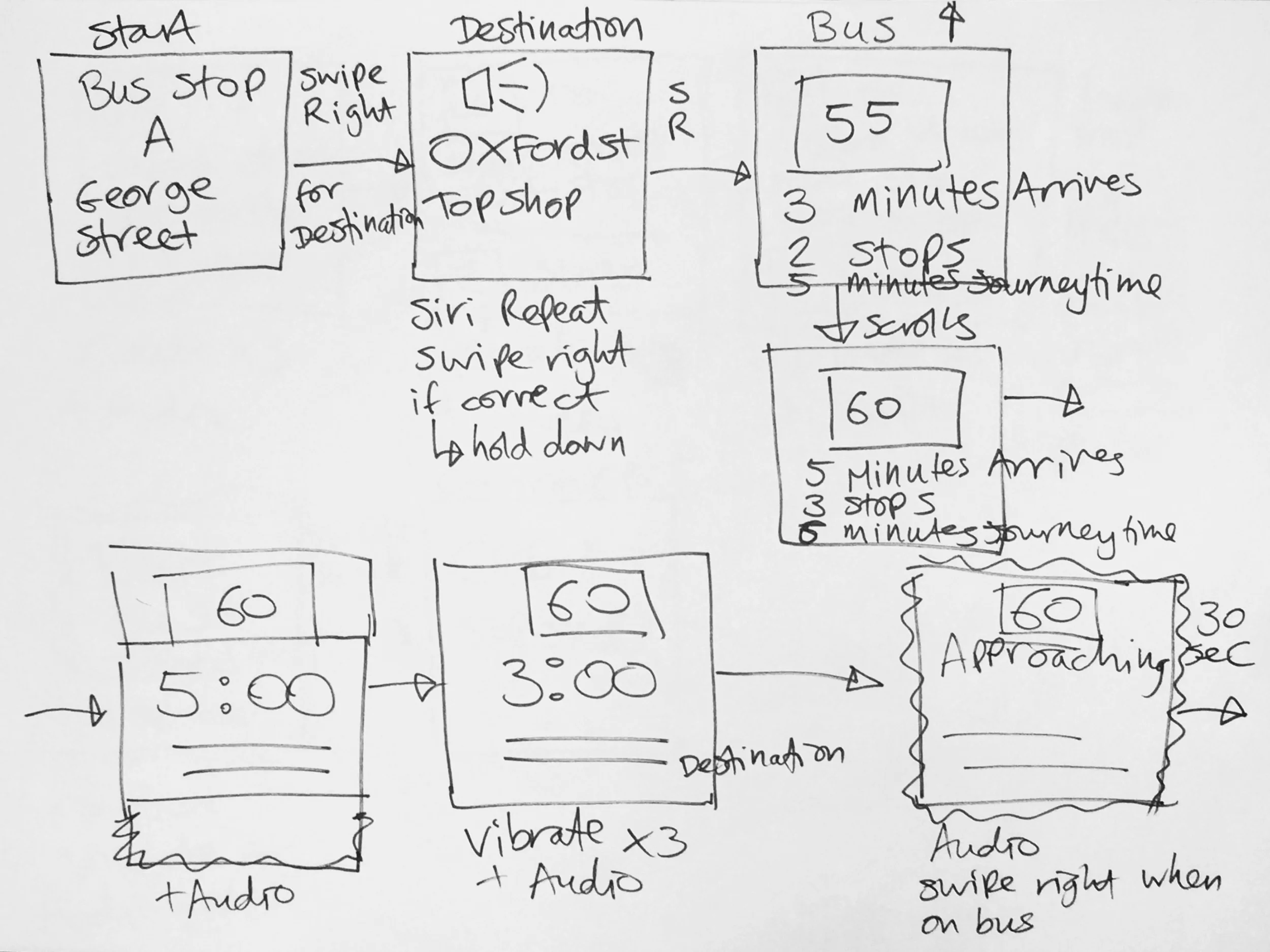
The final designs were annotated with notes for where there would be vibrations for the user to tell them how many minutes there were until the bus arrives. Three vibrations to signify three minutes, two for two, one for one, and a pulsing vibration to notify the user to signal the bus at 30 seconds left, until arrival. Audio for every stage would also be present, with screens being able to repeat the information when reviewing them.
Once the user enters the bus, they can swipe to have the journey repeated to them, giving them the bus number, destination, and number of stops, which they could repeat to the driver to ensure that they are on the right bus, removing the worry of getting on the wrong bus. Upon each stop the number of the bus, number of stops left and street name would be read out, which they could check against the bus audio, (where present) to confirm that the bus is the correct one, and still following the same route, as some buses to change routes as they go.

For disembarking the bus, countdown timers for 3, 2, and 1 stop away are, once again, represented by 3, 2, and 1 vibrations. A pulse vibration for 2 minutes left to get off, would give a reasonable warning to get off the bus. When the bus arrives at the final stop, a constant vibration would be felt, with audio at every stage; and finally a confirmation, once off the bus of the new location, to ensure the user had disembarked at the right stop.
Iterations

From the initial designs we placed an emphasis on screen segmentation, so that users can follow from one screen to another and know that the same information will appear in the same place, from one screen to another, making this paramount in our design. For bus number, number of stops left, and time remaining, simple design methods have been implemented to bring clear element separation, for users with limited vision to easily digest and understand the information.
Through conversation with Alastair Somerville we learned that although high contrast was the most obvious answer, we were informed that black text on a yellow background was the clearest for users.
Future Developments
A more visual approach would be for bus stops to be ‘upgraded’, so that bus numbers on the signs change in appearance to alert drivers that their bus should stop, due to someone waiting at the stop for them. An automated verbal warning and ‘bus stopping’ notification, however, would be more cost effective.
Future considerations for the implementation of the app, in association with companies such as TFL, would be to include an automatic notification to drivers that someone is waiting at a stop for them, and to ensure that a driver stops for them. This can be done through beacon technology, GPS, or wi-fi triangulation.
The app could be further developed for audio directions to and from a bus stop to a starting location, or between bus stops where multiple buses are needed on a particular journey, which could tie into third party apps, such as TFL, National Rail, or City Mapper.
With thanks to...

Rachel Ilan Simpson, Sunil Pithwa, Johannes Start, Dennis Bochen, Dan Martinez, and Laura Hasting for organising the first UK Design Jam Hackathon, and General Assembly for hosting us.
The Prototype

In Closing...
Our Hackathon team of 5 not only addressed the problem of helping visually impaired people to navigate the most likely form of public transport that this user group would use, but created a solution that is transferable to any user on their daily commute, or even on the way home from a night out with friends.
I am particularly proud of our team’s ability to understand the brief and tackle it head on; taking stock of all the information provided to us. The team created a fully evolved prototype that could be implemented straight away, and iterated upon and developed for real-world commercial use.